Wednesday, July 27, 2011

LETTER FROM THE EDITOR OF "THE TIMES OF INDIA " TO THE PRIME MINISTER OF INDIA

Its a must read letter from the editor of Times of India to our honorable Prime Minister pertaining to the corruption and cozenage rooted deep inside the country. A very audacious and powerful letter....

LETTER OF THE EDITOR OF "THE TIMES OF INDIA " TO THE PRIME MINISTER OF INDIA


Dear Mr. Prime minister,

I am a typical mouse from Mumbai. In the local train compartment which has capacity of 100 persons, I travel with 500 more mice. Mouse at least squeaks, but we don't even do that.

Today I heard your speech, in which you said, 'NO BODY WOULD BE SPARED'. I would like to remind you that fourteen years have passed since serial bomb blasts in Mumbai took place. Dawood was the main conspirator. Till today he is not caught. All our Bollywood actors, our builders, our Gutka king keep meeting him, but your Government can not catch him. Reason is simple; all your ministers are hand in glove with him. If any attempt is made to catch him, everybody will be exposed. Your statement 'NOBODY WOULD BE SPARED' is nothing but a cruel joke on these unfortunate people of India.

Enough is enough. As such, after seeing terrorist attack carried out by about a dozen young boys, I realize that if same thing continues, days are not far away when terrorists will attack by air, destroy our nuclear reactors and there will be one more Hiroshima.

We the people are left with only one mantra. Womb to Bomb to Tomb. You promised Mumbaikar Shanghai; what you have given us is Jalianwala Baug. Today only your home minister resigned. What took you so long to kick out this joker? Only reason was that he was loyal to Gandhi family. Loyalty to Gandhi family is more important than blood of innocent people, isn't it? 

I am born and brought up in Mumbai for last fifty eight years. Believe me, corruption in Maharashtra is worse than that in Bihar. Look at all the politicians, Sharad Pawar, Chagan Bhujbal, Narayan Rane, Bal Thackray , Gopinath Munde, Raj Thackray, Vilasrao Deshmukh all are rolling in money. Vilasrao Deshmukh is one of the worst Chief ministers I have seen. His only business is to increase the FSI every other day, make money and send it to Delhi , so Congress can fight next election. Now the clown has found new way and will increase FSI for fishermen, so they can build concrete houses right on sea shore.
Next time terrorists can comfortably live in those houses, enjoy the beauty of the sea and then attack our Mumbai at their will.

Recently, I had to purchase a house in Mumbai. I met about two dozen builders. Everybody wanted about 30% in black. A common person like me knows this and with all your intelligence agency & CBI, you and your finance ministers are not aware of it. Where all the black money goes?
To the underworld, isn't it? Our politicians take help of these goondas to vacate people by force. I myself was victim of it. If you have time please come to me, I will tell you everything.

If this has been a land of fools, idiots, then I would not have ever cared to write to you this letter. Just see the tragedy. On one side we are reaching moon, people are so intelligent; and on the other side, you politicians have converted nectar into deadly poison.I am everything  - Hindu, Muslim, Christian, Scheduled Caste, OBC, Muslim OBC, Christian Scheduled Caste, and Creamy Scheduled Caste; only what I am not is INDIAN. You politicians have raped every part of Mother India by your policy of divide and rule.

Take example of our Former President Abdul Kalam. Such an intelligent person; such a fine human being. But you politician didn't even spare him and instead choose a worthless lady who had corruption charges and insignificant local polititian of Jalgaon WHO'S NAME ENTIRE COUNTRY HAD NOT HEARD BEFORE. Its simple logic your party just wanted a rubber stamp in the name of president. Imagine SHE IS SUPREME COMMANDER OF INDIA 'S THREE DEFENCE FORCES. What morale you will expect from our defence forces? Your party along with opposition joined hands, because politicians feel they are supreme and there is no place for a good person.

Dear Mr Prime minister, you are one of the most intelligent person, a most learned person. Just wake up, be a real SARDAR. First and foremost, expose all selfish politicians. Ask Swiss banks to give names of all Indian account holders. Give reins of CBI to independent agency. Let them find wolves among us. There will be political upheaval, but that will be better than dance of death which we are witnessing every day. Just give us ambience where we can work honestly and without fear. Let there be rule of law. Everything else will be taken care of.

Choice is yours Mr. Prime Minister. Do you want to be lead by one person, or you want to lead the nation of 100 Crore people?

Prakash B. Bajaj
Editor Mumbai-Times of India

Tuesday, July 26, 2011

What's new in Android 3.0 for all you developers

The Android 3.0 platform is designed specially to meet the unique needs of applications on devices with larger screen sizes. It offers all of the tools developers need to create incredible visual and interaction experiences on these devices. Here they are discussed one after another.
New UI Framework for creating great tablet apps
Activity fragments, for greater control of content and design flexibility
Starting with Android 3.0, developers can break the Activities of their applications into subcomponents called Fragments, then combine them in a variety of ways to create a richer, more interactive experience. For example, an application can use a set of Fragments to create a true multipane UI, with the user being able to interact with each pane independently. Fragments can be added, removed, replaced, and animated inside an Activity dynamically, and they are modular and reusable across multiple Activities. Because they are modular, Fragments also offer an efficient way for developers to write applications that can run properly on both larger screen as well as smaller screen devices.
Redesigned UI widgets
Android 3.0 offers an updated set of UI widgets that developers can use to quickly add new types of content to their applications. The new UI widgets are redesigned for use on larger screens such as tablets and incorporate the new holographic UI theme. Several new widget types are available, including a 3D stack, search box, a date/time picker, number picker, calendar, popup menu, and others. Most of the redesigned UI widgets can now be used as remote views in application widgets displayed on the home screen. Applications written for earlier versions can inherit the new Widget designs and themes.
Expanded Home screen widgets
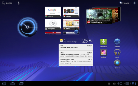
Home screen widgets are popular with users because they offer fast access to application-specific data directly from the home screen. Android 3.0 lets developers take home screen widgets to the next level, offering more types of content and new modes of interaction with users. Developers can now use more standard UI widget types home screen widgets, including widgets that let users flip through collections of content as 3D stacks, grids, or lists. Users can interact with the home screen widgets in new ways, such as by using touch gestures to scroll and flip the content displayed in a widget.
Persistent Action Bar
The platform provides each application with its own instance of the Action Bar at the top of the screen, which the application can use to give the user quick access to contextual options, widgets, status, navigation, and more. The application can also customize the display theme of its Action Bar instance. The Action Bar lets developers expose more features of their applications to users in a familiar location, while also unifying the experience of using an application that spans multiple Activities or states.
Richer notifications
Notifications are a key part of the Android user experience because they let applications show key updates and status information to users in real time. Android 3.0 extends this capability, letting developers include richer content and control more properties. A new builder class lets developers quickly create notifications that include large and small icons, a title, a priority flag, and any properties already available in previous versions. Notifications can offer more types of content by building on the expanded set of UI Widgets that are now available as remote Views.
Multiselect, clipboard, and drag-and-drop
The platform offers convenient new interaction modes that developers can use. For managing collections of items in lists or grids, developers can offer a new multiselect mode that lets users choose multiple items for an action. Developers can also use a new system-wide Clipboard to let users easily copy any type of data into and out of their applications. To make it easier for users to manage and organize files, developers can now add drag-and-drop interaction through a DragEvent framework.

High-performance 2D and 3D graphics

New animation framework
The platform includes a flexible new animation framework that lets developers easily animate the properties of UI elements such as Views, Widgets, Fragments, Drawables, or any arbitrary object. Animations can create fades or movement between states, loop an animated image or an existing animation, change colors, and much more. Adding animation to UI elements can add visual interest to an application and refine the user experience, to keep users engaged.
Hardware-accelerated 2D graphics
Android 3.0 offers a new hardware-accelerated OpenGL renderer that gives a performance boost to many common graphics operations for applications running in the Android framework. When the renderer is enabled, most operations in Canvas, Paint, Xfermode, ColorFilter, Shader, and Camera are accelerated. Developers can control how hardware-acceleration is applied at every level, from enabling it globally in an application to enabling it in specific Activities and Views inside the application.
Renderscript 3D graphics engine
Renderscript is a runtime 3D framework that provides both an API for building 3D scenes as well as a special, platform-independent shader language for maximum performance. Using Renderscript, you can accelerate graphics operations and data processing. Renderscript is an ideal way to create high-performance 3D effects for applications, wallpapers, carousels, and more.

Support for multicore processor architectures

Android 3.0 is the first version of the platform designed to run on either single or multicore processor architectures. A variety of changes in the Dalvik VM, Bionic library, and elsewhere add support for symmetric multiprocessing in multicore environments. These optimizations can benefit all applications, even those that are single-threaded. For example, with two active cores, a single-threaded application might still see a performance boost if the Dalvik garbage collector runs on the second core. The system will arrange for this automatically.

Rich multimedia and connectivity

HTTP Live streaming
Applications can now pass an M3U playlist URL to the media framework to begin an HTTP Live streaming session. The media framework supports most of the HTTP Live streaming specification, including adaptive bit rate.
Pluggable DRM framework
Android 3.0 includes an extensible DRM framework that lets applications manage protected content according to a variety of DRM mechanisms that may be available on the device. For application developers, the framework API offers an consistent, unified API that simplifies the management of protected content, regardless of the underlying DRM engines.
Digital media file transfer
The platform includes built-in support for Media/Picture Transfer Protocol (MTP/PTP) over USB, which lets users easily transfer any type of media files between devices and to a host computer. Developers can build on this support, creating applications that let users create or manage media files that they may want to transfer or share across devices.
More types of connectivity
The platform offers new connectivity that developers can build on. API support for Bluetooth A2DP and HSP profiles lets applications query Bluetooth profiles for connected devices, audio state, and more, then notify the user. For example, a music application can check connectivity and status and let the user know that music is playing through a stereo headset. Applications can also register to receive system broadcasts of pre-defined vendor-specific AT commands, such as Platronics Xevent. For example, an application could receive broadcasts that indicate a connected device's battery level and could notify the user or take other action as needed. Applications can also take advantage of the platform's new support for full keyboards connected by USB or Bluetooth.

Enhancements for enterprise

In Android 3.0, developers of device administration applications can support new types of policies, including policies for encrypted storage, password expiration, password history, and password complex characters required.

Compatibility with existing apps

Android 3.0 brings a new UI designed for tablets and other larger screen devices, but it also is fully compatible with applications developed for earlier versions of the platform, or for smaller screen sizes. Existing applications can seamlessly participate in the new holographic UI theme without code changes, by adding a single attribute in their manifest files. The platform emulates the Menu key, which is replaced by the overflow menu in the Action Bar in the new UI. Developers wanting to take fuller advantage of larger screen sizes can also create dedicated layouts and assets for larger screens and add them to their existing applications.

Tuesday, July 19, 2011

2nd generation of DELL Laptops

The Dell Inspiron R Series 2nd Gen has undergone several changes, both inside and out, compared to their previous model.  The major differences are the new processors that Dell includes and their “Switch” lids.

Looking at the new Inspiron, the thing that jumps out is obviously the lid.  Switch allows you to customize the cover of your laptop to a variety of designs that can be viewed here on Dells website.  While this feature may be a hit with students going off to school looking to impress their peers, like anything, it comes at a price.  The laptops come with the standard black lid included, but buying a Switch lid will run you anywhere from $30 for solid colored covers to $60 for covers with intricate designs.

The port layout on the 14R, while it seemed different at first, ended up being mostly functional.  The ports for Ethernet and your computer adapter are located on the back of the laptop rather than the side.  This made it easier to manage the cords while the laptop was plugged in at a desk.  I didn’t like the USB 3.0 port on the back panel however.  The main use I had for the back USB port was for my wireless mouse.  For most of my other USB devices, such as my mp3 player and flash drive, I preferred the right side 3.0 port and left side 2.0 port just because it was easier than reaching in back of my computer to unplug them all the time.  I would’ve liked to see the 2.0 port on the back rather than the 3.0 port so that the extra speed wasn’t wasted.

Enough about the looks and layout of the laptop and onto what’s inside of the R Series. Dell includes some of Intel’s newest processors; the i3, i5, and i7 along with either an Integrated 1664MB Intel HD 3000 or a more advanced AMD Radeon HD 6470M (64-bit) 512MB video card.  With these, the Inspiron was able to handle playback of HD movies and majority of computer games.  Games that required a lot of processing power didn’t play as well, but that is expected given that the Inspiron wasn’t made to be a gaming laptop. The RAM on the Inspiron 14R is expandable up to 6GB and allowed the computer to handle multitasking well.  I was able to have several programs open at a once, even ones that take up a lot of processing power such as music and movies, without having the laptop become sluggish or non responsive.  Battery life with the laptop was reasonable.  I got about 3 hours out of the standard 6 cell battery pack with normal use.  If that isn’t enough for your needs an optional 9 cell pack will cost you $179.99.

With the R series, you can also include an optional Blu-ray player instead of a standard CD/DVD drive.  I liked this feature because you can use the HDMI output on the laptop to connect to an HD TV and watch your Blue-ray disks on a much bigger screen.  It even supports playback of 3D movies if you have a 3D TV.  If you don’t want to use an HDMI cable, you can get the Wireless Display (WiDi) package which, with the purchase of Netgear’s Push2TV adapter ($79.99), can be used to stream HD movies from your computer directly to your flat screen in up to 1080p.

While the 14 inch screen on the 14R was a little smaller than what I was used to, it ended up allowing me to get some more time out of the battery.  Dell also offers 15 inch and 17 inch models.  Using the computer also felt comfortable.  The keyboard was easy to type on and the track pad was large enough to make navigating quicker, but small enough that it didn’t get in the way while you were typing.  With its new hardware, new look, and a relatively low price starting at $549.99, the Inspiron 14R ends up being an economical option for college students who don’t need a gaming laptop.

Thursday, July 14, 2011

Terror story behind death dance macabre in Mumbai

More than 750 peoples have already been killed so far in more than half a dozen attacks on the financial capital of India ever since 1993. The country is yet to recover from the attack in November 2008 and the main accused Kasab is yet to be hanged and here is another serial blast on Wednesday to shock us all.

What is the reason behind high frequency of such attacks on Mumbai? Why it has become the most favorite place for the terrorists that there have been more than 6 blasts in around 18 years? Why no other city but Mumbai bleeds again and again and despite of all secret services and securities the terrorism is not getting extinguished?

As per the ministers, Mumbai and Delhi will always remain the most targeted cities on the list. But we all know the financial and entertainment capital is more prune to attack than the actual capital Delhi. Though attack on Mumbai grabs attention of the entire country in a blink so that may be one of the reason why terrorist choose Mumbai every time. But the main reason lies somewhere else deep in the past.

It all started in early 1993, just two weeks after the demolition of the Babri mosque by Hindu fanatics in December 1992, which killed more than 900 people and it triggered the serial bomb attacks, just two months after the riot, which killed more than 250 people. This is when the rule of law broke down in the city and a liberal city ruled by law and order turned into a city infamous for heinous crime, killings and terrorism. Once initiated the crime graph never went down in the city. It was only the last month, when gunmen shot dead the city's leading crime journalist on a rainy morning and zipped away openly on their motorbikes. Its the same city where the flats meant for war widows was allegedly grabbed by politicians, retired army officers and business giants.

The image of the city has turned out to be a chimera with bloodshed every other day. This crime chain needs to be broken in order to put law and order back or else Mumbai may go the Karachi(Pakistan's port city) way where terrorist attacks are as common as some festival or cavalcade.

Tuesday, July 12, 2011

Android 3.0 : Features at a glance

The new Android 3.0 comes up with bunch of new features for both users and developers and it is basically designed for big screen devices like Tablets. Here are some of the excellent features in the new release :

New UI designed from the ground up for tablets

It introduces a brand new, truly virtual and “holographic” UI design, as well as an elegant, content-focused interaction model with refined multitasking, rich notifications, Home screen customization, widgets and more. 

The new UI brings fresh paradigms for interaction, navigation, and customization and makes them available to all applications even those built for earlier versions of the platform. Applications written for Android 3.0 are able to use an extended set of UI objects, powerful graphics, and media capabilities to engage users in new ways.
System Bar, for global status and notifications
Across the system and in all applications, users have quick access to notifications, system status, and soft navigation buttons in a System Bar, available at the bottom of the screen. The System Bar is always present and is a key touchpoint for users, but in a new "lights out mode" can also be dimmed for full-screen viewing, such as for videos.
Action Bar, for application control
In every application, users have access to contextual options, navigation, widgets, or other types of content in an Action Bar, displayed at the top of the screen. The Action Bar is always present when an application is in use, although its content, theme, and other properties are managed by the application rather than the system. The Action Bar is another key touchpoint for users, especially with action items and an overflow dropdown menu, which users frequently access in a similar manner in most applications.
Customizable Home screens
Five customizable Home screens give users instant access to all parts of the system from any context. Each screen offers a large grid that maintains spatial arrangement in all orientations. Users can select and manipulate Home screen widgets, app shortcuts, and wallpapers using a dedicated visual layout mode. Visual cues and drop shadows improve visibility when adjusting the layout of shortcuts and widgets. Each Home screen also offers a familiar launcher for access to all installed applications, as well as a Search box for universal search of apps, contacts, media files, web content, and more.
Recent Apps, for easy visual multitasking
Multitasking is a key strength of Android and it is central to the Android 3.0 experience. As users launch applications to handle various tasks, they can use the Recent Apps list in the System Bar to see the tasks underway and quickly jump from one application context to another. To help users rapidly identify the task associated with each app, the list shows a snapshot of its actual state when the user last viewed it.

Redesigned keyboard

The Android soft keyboard is redesigned to make entering text fast and accurate on larger screen sizes. The keys are reshaped and repositioned for improved targeting, and new keys have been added, such as a Tab key, to provide richer and more efficient text input. Users can touch-hold keys to access menus of special characters and switch text/voice input modes from a button in the System Bar.

Improved text selection, copy and paste

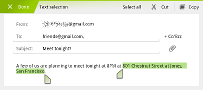
When entering or viewing text, a new UI lets users quickly select a word by press-hold and then adjust the selection area as needed by dragging a set of bounding arrows to new positions. Users can then select an action from the Action Bar, such as copy to the clipboard, share, paste, web search, or find.

New connectivity options

Android 3.0 includes new connectivity features that add versatility and convenience for users. Built-in support for Media/Picture Transfer Protocol lets users instantly sync media files with a USB-connected camera or desktop computer, without needing to mount a USB mass-storage device. Users can also connect full keyboards over either USB or Bluetooth, for a familiar text-input environment. For improved wi-fi connectivity, a new combo scan reduces scan times across bands and filters. New support for Bluetooth tethering means that more types of devices can share the network connection of an Android-powered device.

Updated set of standard apps


The Android 3.0 platform includes an updated set of standard applications that are designed for use on larger screen devices. The sections below highlight some of the new features.
Browser The browser includes new features that let users navigate and organize more efficiently. Multiple tabs replace browser windows and a new “incognito” mode allows anonymous browsing. Bookmarks and history are presented and managed in a single unified view. Users can now choose to automatically sign into Google sites on the browser with a supplied account and sync bookmarks with Google Chrome. New multitouch support is now available to JavaScript and plugins. Users can enjoy a better browsing experience at non-mobile sites through an improved zoom and viewport model, overflow scrolling, support for fixed positioning, and more.
Camera and Gallery
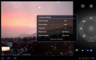
The Camera application has been redesigned to take advantage of a larger screen for quick access to exposure, focus, flash, zoom, front-facing camera, and more. To let users capture scenes in new ways, it adds built-in support for time-lapse video recording. The Gallery application lets users view albums and other collections in full-screen mode, with easy access to thumbnails for other photos in the collection.
Contacts
The Contacts app uses a new two-pane UI and Fast Scroll to let users easily organize and locate contacts. The application offers improved formatting of international phone numbers as user types, based on home country and an international number parsing library. Contact information is presented in a card-like UI, making it easier for users to read and edit contacts.
Email
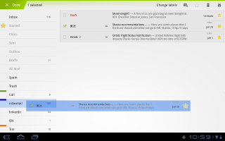
The Email application uses a new two-pane UI to make viewing and organizing messages more efficient. The app lets users select one or more messages, then select an action from the Action Bar, such as moving them to a folder. Users can sync attachments for later viewing and keep track of email using a home screen Widget.

Saturday, July 9, 2011

FEAR 3 : Less to fear about and more for combat actions

The latest sensational action-horror game, F.E.A.R. 3 is out and this time it is much more than a first person shooter game. Comparing the action while involved in combat to the thriller or horror, the game seems to be more on the action side making it less scary than expected. Here is a close review of this newly released game.

Continuing to be on its main streamline, the game is full of combat features and a deadly paranormal story with some on screen tensions. There are multiple modes to play the game in which co-op mode should be preferred in which you can use ability of multiple characters to score maximum points and clear up levels effectively.

While the action is pretty linear, there are detours in which you can search for hidden weapons and ammo, psychic link gathering locations, and an Alma doll, which scores big points when found. There are enemies who require some extra work to defeat, including one called a Phase Caster, who summons additional soldiers over and over. Killing him first will be a wise decision.

As expected, there are some thrilling horror moments in the game and watching them as a lead actor can horrify anyone while playing the game but the negative point is such moments are not so frequent as you will be expecting. You will be expecting some horrifying event at multiple times but they will turn out to be action specific. Such moments are plenty in number and i am sure by the end of the game you will be looking for more combat occasions rather than horrifying ghostly events.

Multiplayer modes help make the game fun to replay. You can work together with your teammates to survive waves of enemies emerging from an advancing fog, or be possessed by Alma and try to take over your former teammates. F.E.A.R.3 is a well-made first-person shooter that will challenge players with intelligent enemies and compelling battles but at the same time it will make ghosts sad because being more on action side and not on horror side.

Friday, July 8, 2011

Picasa and Blogger brands about to get retired

Its time to say Goodbye to popular Google services Picasa and Blogger as Google intends to retire all non-Google brands and rename them as Google Products.

As per the announcement, the only exception to this step will be Youtube which will be known as it is and will not be re-branded. No need to panic though, as your favorite Google Apps including Picasa and Blogger are not getting away they are just getting re-branded and will be called Google Pics and Google Blogs hereafter.

This move is just a part of the larger effort to unify all Google's product and services which is initiated after the launch of Google+, the search giant's social networking engine.

Google owned Picasa since 2004 and it acquired Blogger in 2003. Both of these services are most popular web services throughout the world and also listed in top 10 visited websites. Re-branding non-Google services is not a new stuff as Google has already done this before to re-brand Jotspot into Google Sites and VOIP platform GrandCentral into Google Voice.

Though re-branding may affect some of the users in certain aspects but it will be pleasant experience after the move and it will also assist in integrating the two popular services into Google+. This entire transition from non-Google to Google products is expected to take around 4 weeks to 6 weeks of work.

Thursday, July 7, 2011

Facebook adds video chat right after announcement of Google+

Finally, facebook is also encouraging its users to chat face to face over the web partnering with Skype for the same.

Facebook announced integration of video call yesterday, after which Facebook's version will show up on the site as a "call" button at the top of users' profile pages. By clicking that or finding someone in a new "buddy list" bar on the right-hand side, Facebook users can talk to each other as long as they have webcams.

The interesting point is that this feature is announced just a week after the announcement of Google's networking site Google+ which will have video chat feature. Obviously it seems to be an influenced announcement from facebook to stay in the race.

Facebook claims that this will be "the world's easiest one-click way" to chat over video. Within a few days, you will be able to get hands on Google+ as well as the video chat on Facebook. Hold your nerves till then to experience the best video chat experience on your social network.

Announcing another feature in the facebook, there will be a change to its instant-messaging service, which now allows people to create on-the-fly group conversations. Similar to video chat feature, this feature is also influenced with the announcement of Google+. All these Facebook announcements seem to be catchups in term of features to stay ahead in the race of social networking site.

Wednesday, July 6, 2011

Facebook's Mark Zuckerberg : The most popular Google+ user

With Google+, Google is about to challenge the dominance of Facebook in social networking.

But the biggest surprise is that the most popular Google+ user is none other but Mark Zuckerberg, the name behind facebook. On 5th July, Zuckerberg surprised some folks by being one of the first to create a Google+ account and he was immediately followed by 29543 other users. Nearly 10000 more followers than the second most popular person Larry page, Google CEO's list of followers which is 19878. After Zuckerberg and Page, the top 10 is rounded out with four more prominent Google staffers (co-founder Sergey Brin, engineers Vic Gundotra, Matt Cutts and Bradley Horowitz) and tech journalists Robert Scoble, Leo Laporte, MG Siegler and Gina Trapani.

Google unveiled its long-anticipated social network last week. Since then, it's been opened up to journalists, bloggers and others in the tech community, but not yet to the general public.

Another surprising fact is that top 100 list of popular Google+ users is virtually celebrity free whereas in the same world Twitter is almost owned by celebrities like Gaga, Bieber and others. The only exception in top 100 users is the actress, web-series creator and geek icon Felicia Day , taking the No. 39 spot with 2587 followers.